
2024 Presidential Candidate signup review
We're covering the 2024 Presidential Race, with automatic updates of press releases, tweets, and other information on the candidates.
As part of the process, we've signed up for updates from all the major candidates. Here's the initial thoughts from someone who has worked in both politics and tech.
Joe Biden
Very clean page. I'd prefer not to have to scroll down to enter my email, but the multiple donation buttons are a good choice for the top row.

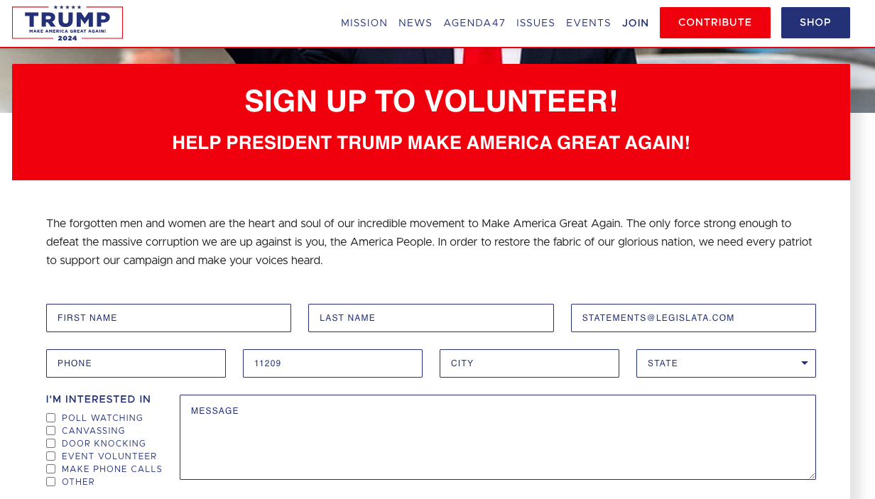
Donald Trump
Email signup takes you directly to a volunteer form. Not the best aesthetic but the simplicity impressed me.
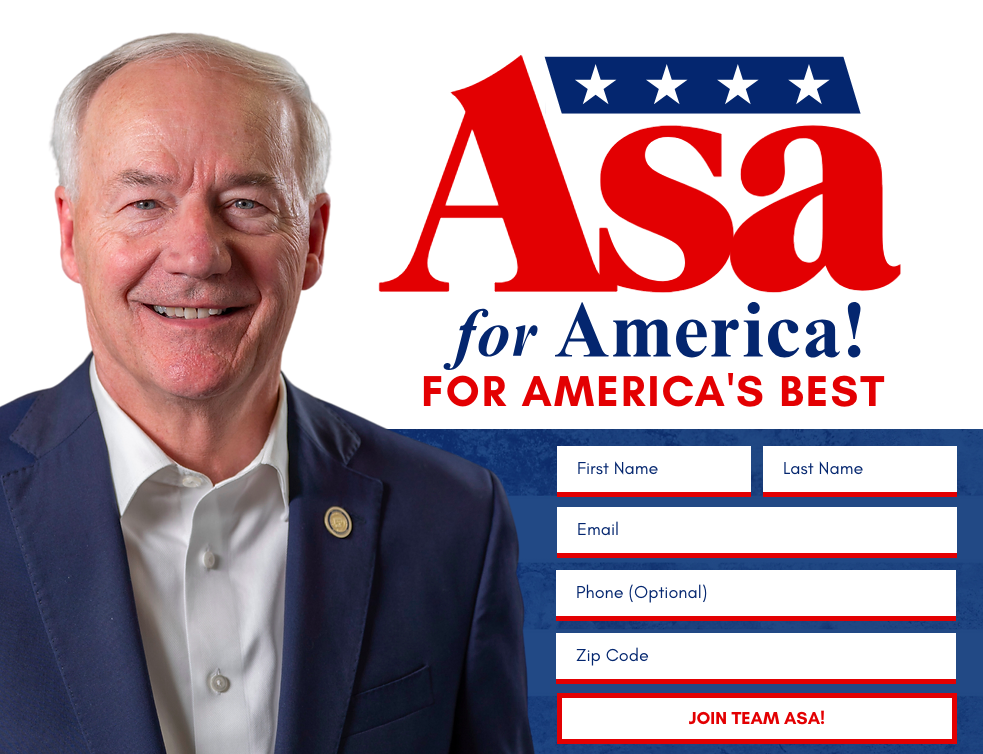
Asa Hutchinson
The form cleared as soon as I submitted my details. It was a bit jarring and made me wonder if it had worked. Not great that the first interaction with the candidate is a question of if something is working.
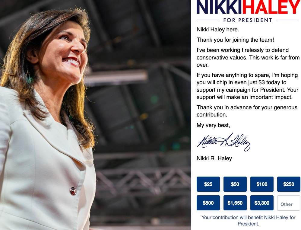
Nikki Haley
The best Republican signup form. A simple email submission took me to this page, which not only is friendlier than the others, but the donation submissions prompt the user for a high-value donation by providing really high options to shift the giving Overton window. There was a video popup when logging on to block the email signup, but it was clearly a popup occupying only a portion of the screen so it was clear that the user was meant to click off it if they didn’t want to watch the whole thing.
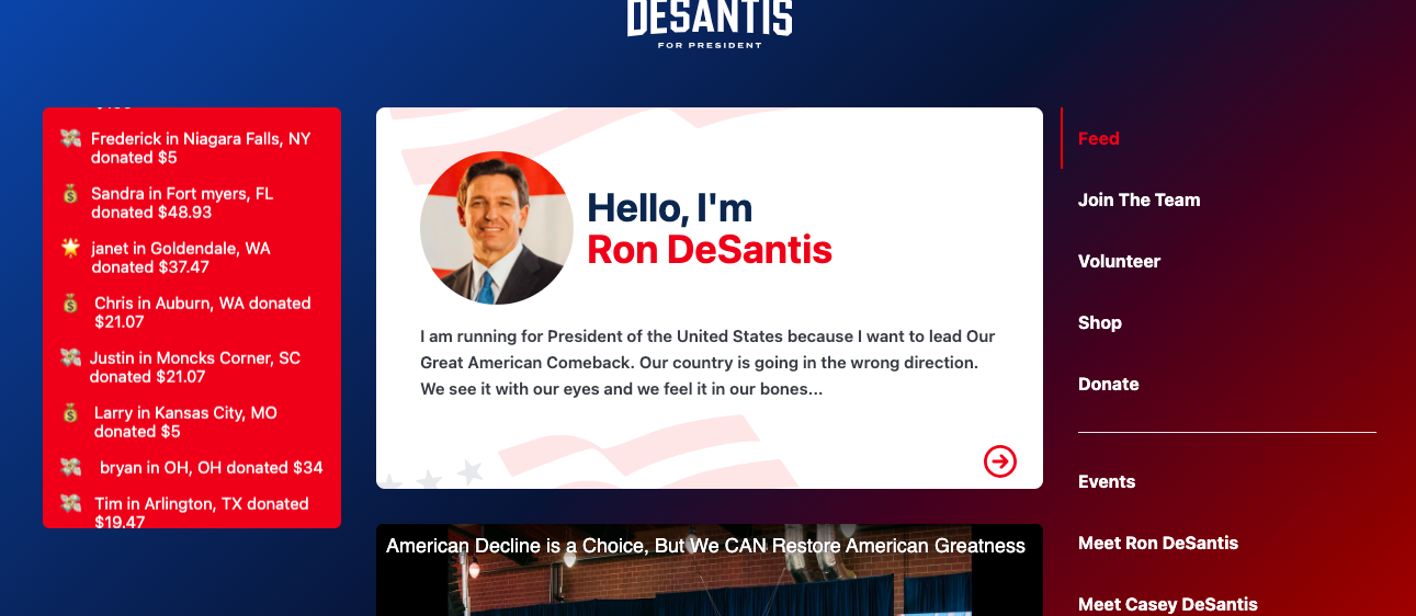
Ron DeSantis
The worst one. The front page had no email collection form, the welcome message seems stilted (odd capitalization and "I am running" vs. "I'm running" a basic error). The Join the Team button took me to a WinRed page, which seemed to be designed for mobile even though I was on a laptop.

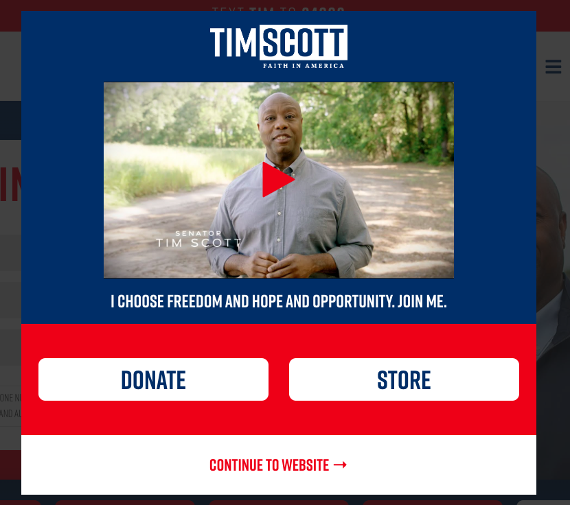
Tim Scott
The landing page is a video from the candidate with buttons for donate or store. Not great if I'm a potential volunteer who wants to find out more before doing so.
Conclusions
Presidential elections aren't won or lost on campaign landing pages. But they do reflect the competence of a campaign and what they're going for.
The best were Joe Biden and Nikki Haley by a long way. Both led with donations and images of the candidates as design features, but made it very simple to sign up. Joining an email list felt like a priority and they weren’t simply after your money.
Trump’s really leaned into the volunteering aspect, taking you to that page as soon as the email was in.
The worst, by an even longer way, was Ron DeSantis. There was no email signup on the landing page and it's laid out like a social media timeline, with a scroll of YouTube videos and merchandise promotions. It was jarring to visit it after all the other candidates' much more traditional pages.
This, of course, is in no way an endorsement of any particular candidates, but a comment that their website is the first thing that many interested voters will engage with, and it’s illuminating to see what face the campaigns choose to present to the world.